If you've come by the site in the past day or so you'll have noticed that things were in flux, as I changed the site's formatting and color themes, as well as rearranged things. Sorry for any confusion and, on occasion, total breakdown—at one point I had made a single change and the whole site's content disappeared!
The color change was much-needed, as the previous color scheme and layout (3 column) made things hard to read and to navigate. I knew the overall effect was too dark when a visitor asked "why the Darth Vader mode?" I hope that the new look will be much lighter and more navigable.
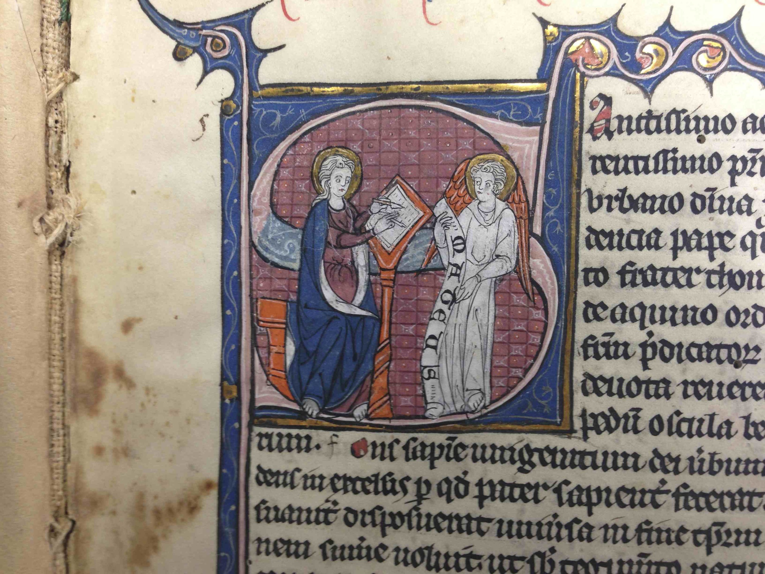
I've added some photos that Jörgen Vijgen took this past summer, switched to a two-column layout, and restructured the main menu bar. Other changes will come as I'm able to find out what will, and what won't, break the site. Some general notes:
- Wallpaper: I'm working on some wallpaper that works better with increasingly common widescreen monitors (i.e., 16x9 format, as distinct from the 4x3 that the current wallpapers are set to).
- Traffic notes: almost 40% of the site's visitors still use Microsoft's Internet Explorer 6.0! People! Please upgrade your browser. Most new sites are using updated website-coding techniques (e.g., CSS 3), and you'll be left on the outside. Besides, Firefox and Safari and wonderful.
- I've created a "Support" menu item—tongue-in-check, that—that houses some link lists, book recommendations, and will be the main location for translations I've done in the past.
- The donation, Cafepress.com, and Squarespace links on the side column are a sign of the economic realities of running (and funding) the site.
More real news posts should follow in short order, now that I've got the site looking more organized. Thanks to all for their suggestions.


